
Rethinking BookIt:
How I cleared design debt to reduce user frustration and triple mobile adoption
Booking a company vehicle, a task that should’ve taken seconds, took users 6 minutes of frustration.
BookIt, a B2B company vehicle booking platform, was built without a designer with the motivation to “ship it out fast”.
The result was inevitable: a product buried under years of design debt — slow, cluttered, and unintuitive.
To clear these weeds of design debt, I joined to bring clarity, intention, and user-centred thinking to a product that never had it.
Informed by user insights and a deep UI and component-level audit, this redesign not only transformed BookIt into a cohesive, modern, and intuitive experience but also reduced booking time by 65% and skyrocketed mobile adoption.
Overview
Responsibilities
UX research, UI audit, Strategic redesign, Design system alignment, Iterative design, Design debt prevention, Responsive design
Role & Team
Lead UX designer (my role)
Engineer
Product manager
Timeline
6 weeks
Due to NDA restrictions, only limited and low-fidelity design visuals are shown
Business Outcome
↓ Reduced booking time from ~6 minutes to 2 minutes
↓ 40% less interactions to make a booking on desktop and mobile
↑ Tripled carpooling adoption
For the business, the redesign boosted user satisfcation, improved adoption and eliminated accumulated design debt, creating a scalable foundation for future growth.
Problem
Buried Under Years of Design Debt
From a product perspective, BookIt seemed like it simply needed more features to improve its experience. But from a UX perspective, the real issue ran much deeper.
Accumulated design debt had created a fragmented, inconsistent experience where users struggled to make bookings efficiently, scan for important information, and discover a key value-add of the platform — carpooling.
There was a tension between what the original design supported, versus what users needed. This was the true barrier to a usable, intuitive platform. My challenge was to uncover these root causes and rebuild the experience with clarity, intention, and a user-centred approach.
UI & Component level audit
Uncovering the Root Cause
I kicked off the redesign with a rigorous audit of the current state, breaking it down to analyze which components were used, what user actions or outcomes they were optimized for, and how each component could impact the user workflow.
This step was crucial for hypothesising potential root causes of the problems.
The result of the audit revealed four fundamental design decisions that caused friction for users that quickly wanted to create a booking.
1. Dense tables and overloaded drawers slowed users
Tables for everything, drawers with too many inputs, all in one screen.
User impact: poor scanability, slow task completion, and difficult mobile experience
2. Layout and hierarchy didn’t reflect real booking decisions
Important info buried, primary actions unclear, flows didn’t match how users think.
User impact: high cognitive load, unnecessary clicks, and low discoverability of key features.
3. Forced fields blocked exploration
Filters inside the make booking form forced users to pre-filter before they could browse, working against natural discovery.
Result: friction, unnecessary decisions upfront, and discouraged ridesharing.
4. Misaligned components (Material UI vs EROAD design system)
BookIt was built using Material UI’s default styling, straying away from EROAD’s Ant-design-based design system.
User impact: visual inconsistency, unpredictable interactions, fractured experience
User Research & Analytics
Listening to the Pain Points
A big part of the component audit was asking: What user needs does each component support? However, to see if this aligned with users’ actual needs, I needed to understand their goals at each step of the booking flow.
By conducting user interviews and leveraging Pendo data, I gained a clear understanding of user needs and pain points. This provided direction on which components could replace the old to better support users’ goals.
This reaffirmed that users weren’t struggling due to missing features — the interface itself created friction.
Ideation
Redesigning from the Ground Up
Having discovered which components were working against users and which alternatives better supported their needs, I began recreating the interface from the ground up.
By redesigning the experience with intention, each element of the redesign had a clear purpose and directly supported the user’s goals.
Tables → Lists
Improved scannability — especially on mobile — letting users quickly find the vehicle they needed without horizontal scrolling.
Cluttered drawers → Stepped flow
Reduced cognitive load and improved responsiveness, giving users a clear, focused path on both desktop and mobile.
Upfront fields → Filters
Users could explore first and commit later, naturally discovering our value-add’s like carpooling.
Defined hierarchy & IA
Key information surfaced contextually; clear primary actions removed guesswork from the UI.
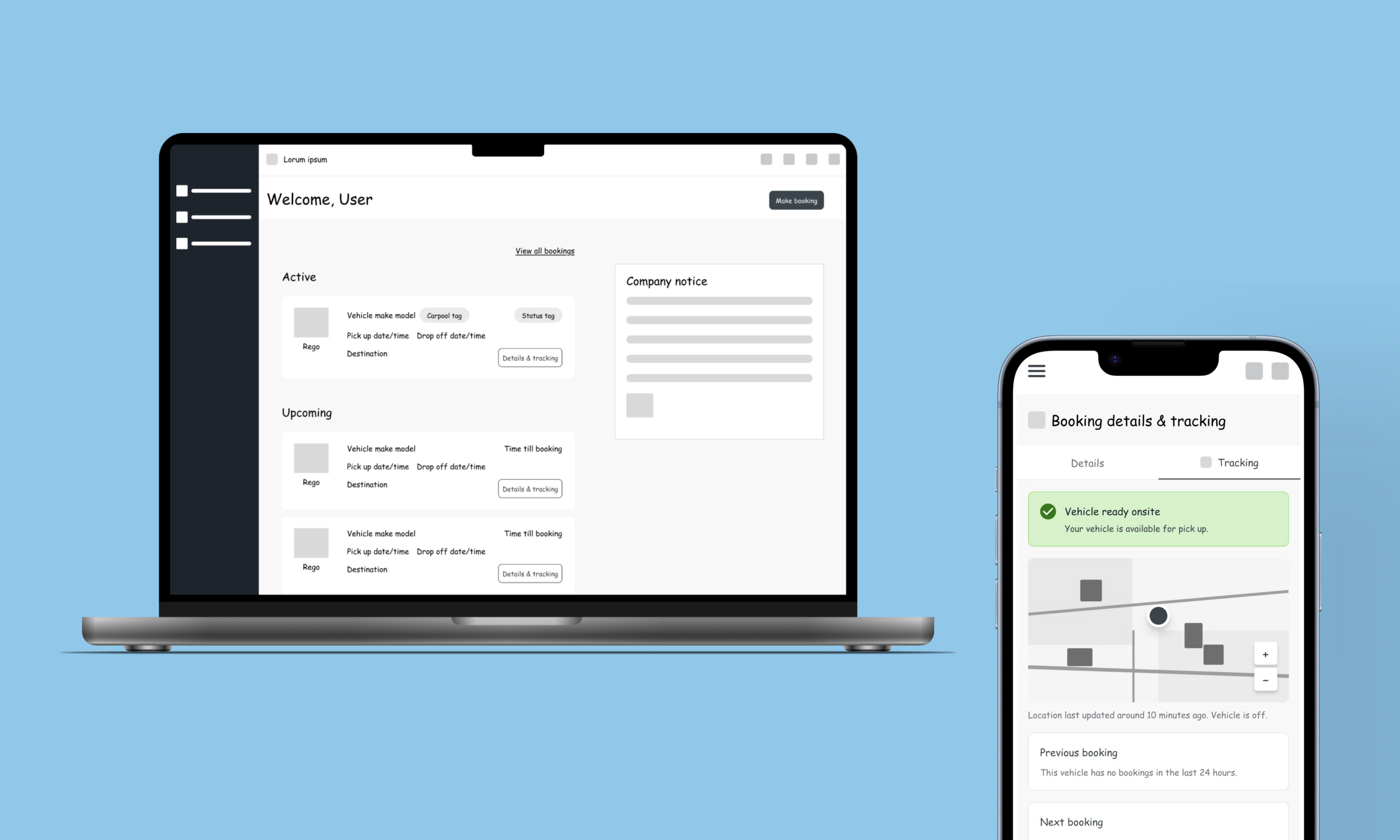
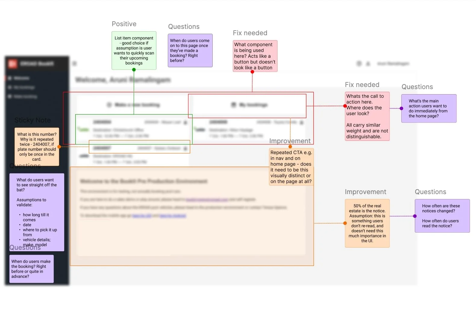
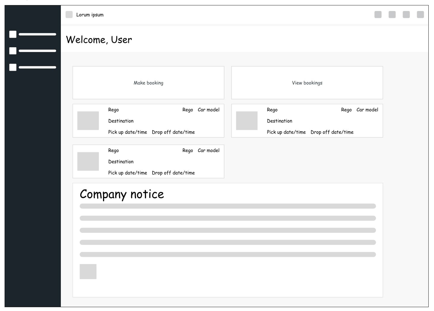
The homepage now guides users instead of overwhelming them. A clear primary action, cleaner hierarchy, and smarter grouping give users an immediate snapshot of their current and upcoming bookings.
Home page
Old
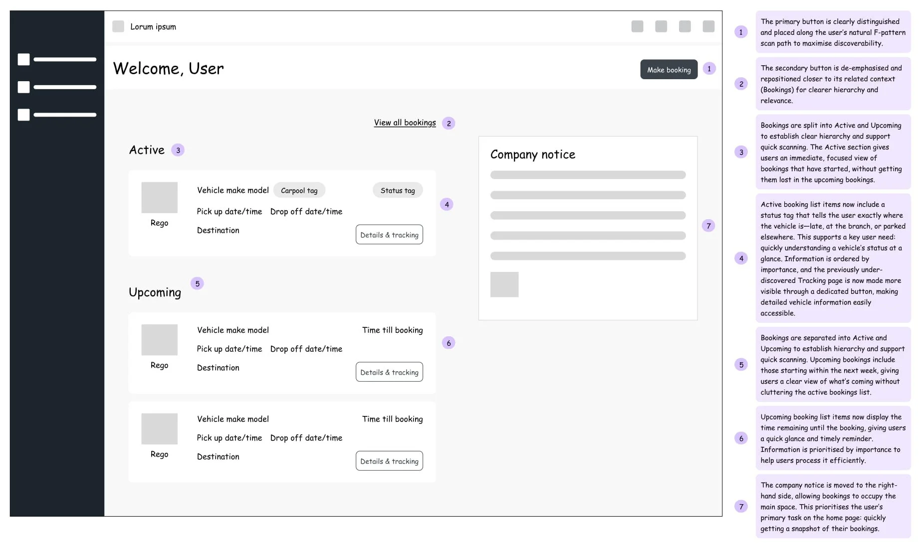
Redesigned
The new booking form simplifies user effort, reducing cognitive load and preventing users from being funneled into early decisions. It asks only where and when, moving everything else into filters so users can explore first and decide later.
Make booking form
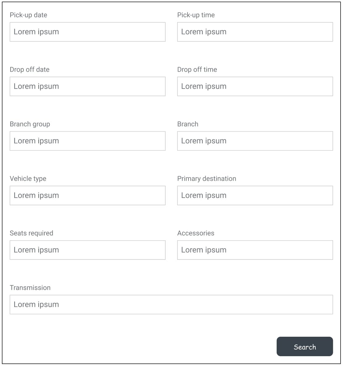
Old
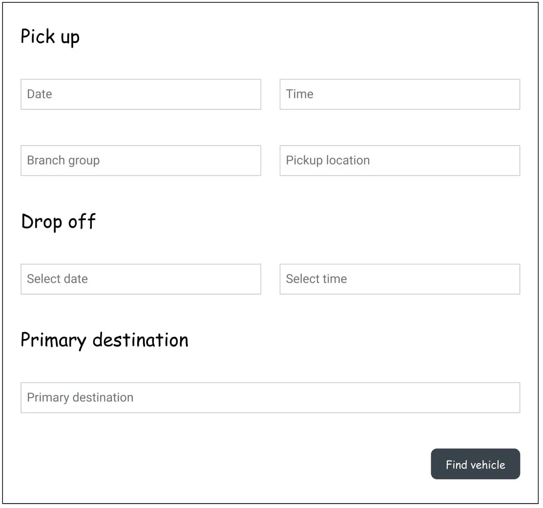
Redesigned
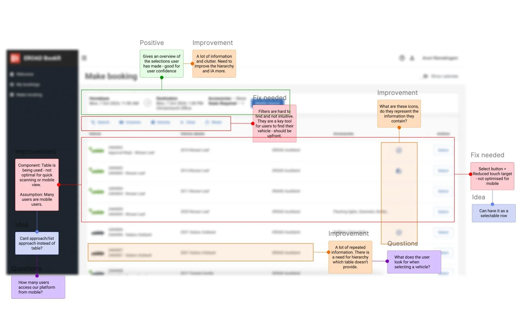
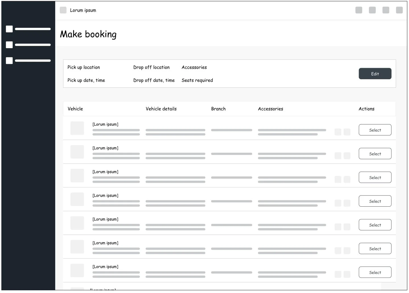
The redesigned search results page boosts mobile scannability, letting users quickly compare options. Lists, icons, clear hierarchy, and quick-glance vehicle details reduce effort and speed decision-making.
Booking search results
Old
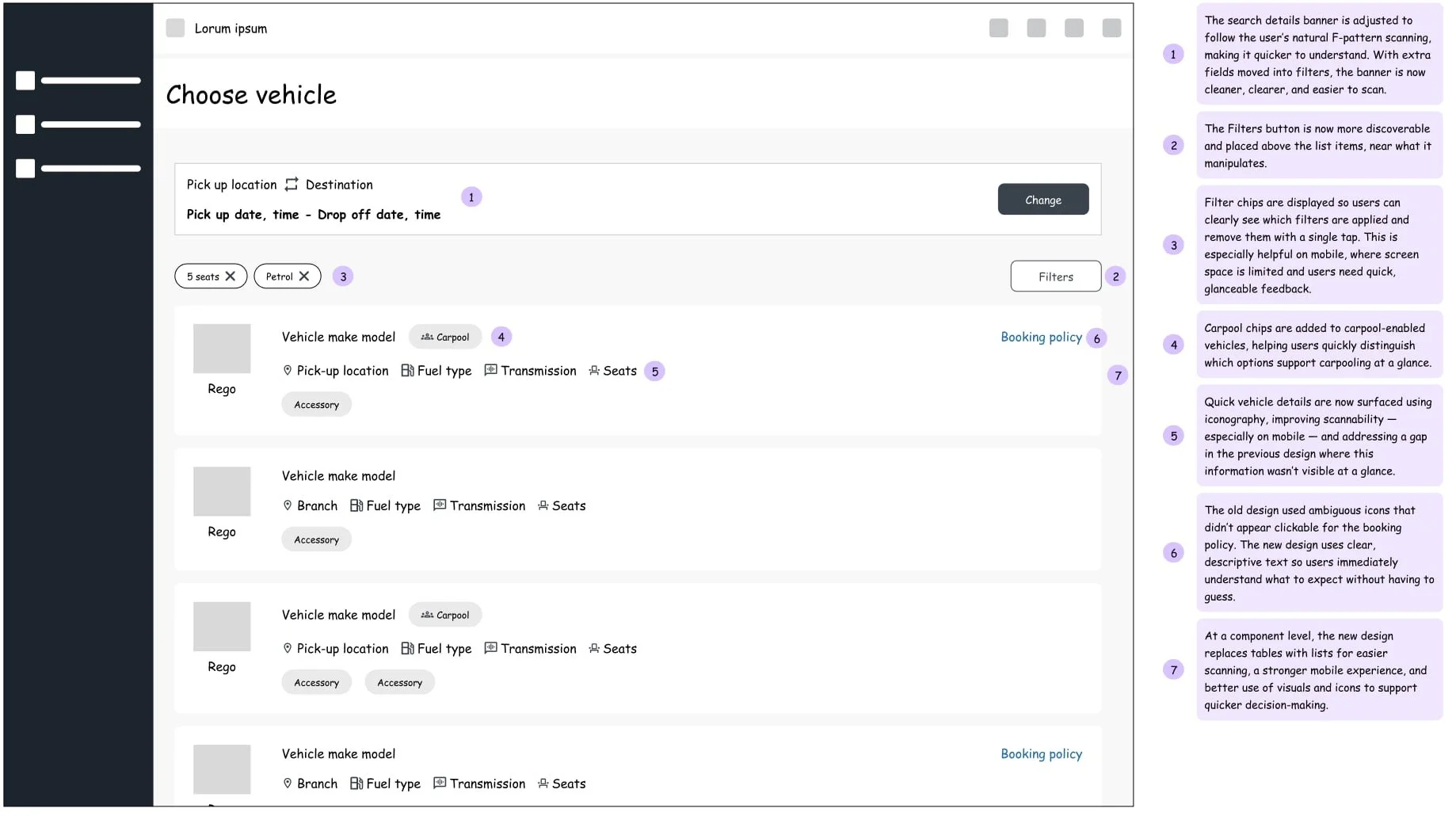
Redesigned
Recognizing high mobile drop-offs, I redesigned the tables as scannable lists — this change alone reduced drop-offs by 25%.
Carpooling discoverability also increased by 46% — this meant a key competitive advantage of our platform was finally seen by our users.
Design System Realignment
Bringing Components Back into Line
The last “weed” to clear was that the original design had completely strayed from our design system. Although the product was built in Material UI (different from our Ant Design–based system), it was crucial for me to bring it back into alignment in terms of styling and pattern usage.
Consistent spacing, typography, and iconography
Alignment with Ant Design principles
Cohesive, brand-consistent experience
Mobile-first, responsive design
This step was essential to prevent future design debt and create a cohesive, intuitive experience for our users.
Testing What Works
Validation & User Testing
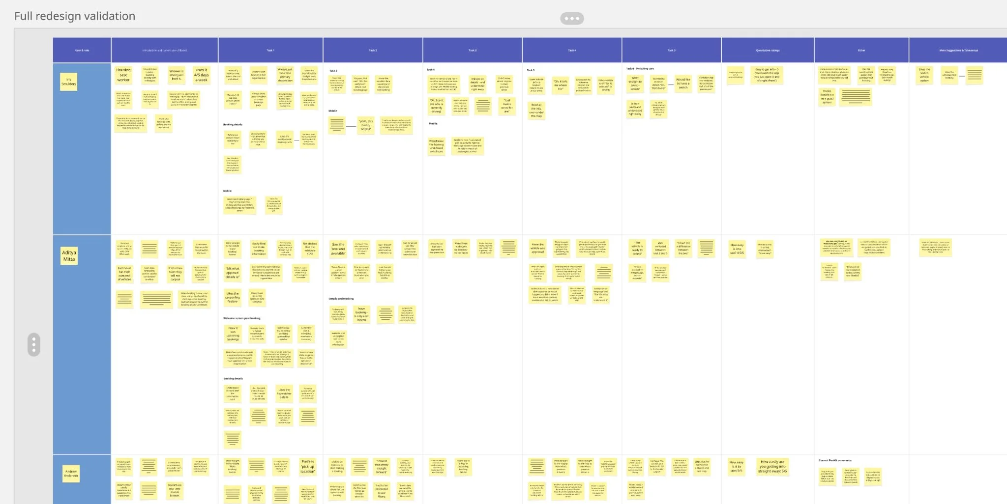
With the new designs, I ran three rounds of usability tests with eight users to validate and iterate on the interface.
Engaging users early and designing each component with intent proved to address the major friction points caused by the old design. The testing revealed areas for refinement, leading to improvements in wording, microcopy, and interaction patterns.
Preventing Design Debt Before It Starts
Reflection
Design debt = poor user experience = costly for businesses.
This project gave me the chance to prevent it from creeping back in through component-level thinking, design system alignment, and early and consistent user research.
However, protecting products from design debt doesn’t stop when a project ends. After the redesign, I documented all design decisions, from rationale, patterns, to deviations, reducing ambiguity for future teams. I also initiated quarterly design audits to catch inconsistencies early, ensuring the product remains cohesive and user-friendly over time.
Theres More to Share!
There’s more depth behind the flows, interaction decisions, mobile optimisations and usability tests. I’m happy to share these in interviews or private walkthroughs.